Flashback – Close your eyes. Can you remember the smartphone you had 5-6 years ago? You know, those times when you strolled around the city while surfing the web on your iPhone with 3GS? Back then, an iPhone had a measly resolution of only 480x320 pixels. Now hop back into the time machine! In the meantime, the iPhone 6s Plus has reached a whopping resolution of 1920x1080 pixels! Smartphone screens have become so much sharper, quicker, and more sensitive. Whether you’re carrying an iPhone 6s, a Nexus 6 or a Galaxy 7, the pixel density is so high that you’ll hardly believe your eyes.
This is even more reason why your mobile friendly newsletters need to stay crisp and sharp, down to the last detail. Here are 3 Mail Designer Pro tips to help you achieve just that:
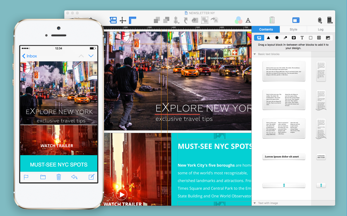
1. Totally broad: Find the right width for your mobile newsletters
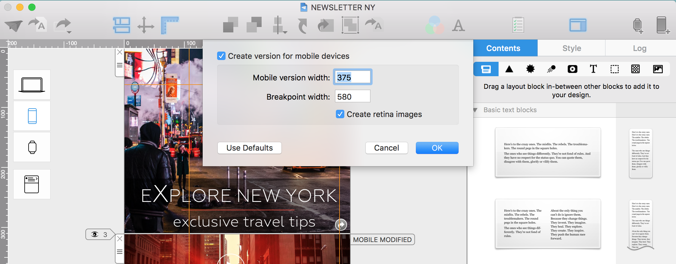
In order to display as much as possible on mobile screens, the width of your newsletter can easily be adjusted in Mail Designer Pro. You can find the settings File > Mobile Options. Based on our experience, an average width of 375 is usually best. This covers smaller displays and the iPhone 6s pixel-perfectly. Your newsletter will come across crisp and clear on the iphone 6s, with its higher resolution, yet an outer white border remains. In settings, you’ll need to check the box, Create Retina images.
2. Export high resolution pictures for your mobile version
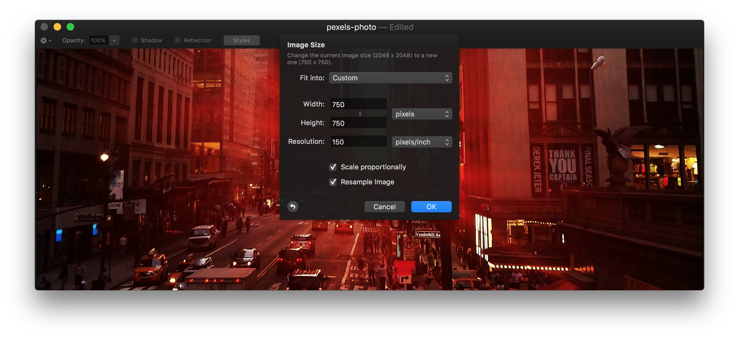
When creating pictures for the mobile versions of your newsletters, you must always use the double width of the picture which you previously adjusted under Mobile Options. For a mobile newsletter with a width of 375px, you’ll have to use a picture with at least 750px. It can also be larger, leaving room for scaling.
Using Pixelmator, Adobe Photoshop, or Affinity Photo, you can export your pictures as a PNG with a screen resolution of 150 dpi (bzw. 144dpi in Photoshop). Now you can take your PNG picture and drag it into the picture place holder of a mobile layout block.
When you select the picture, you can view the original resolution by right clicking and choosing Original Size. A red “2x” symbol warns you in case pictures happen to be too small for a Retina presentation.
3. Individually adjust image compression in mobile newsletters
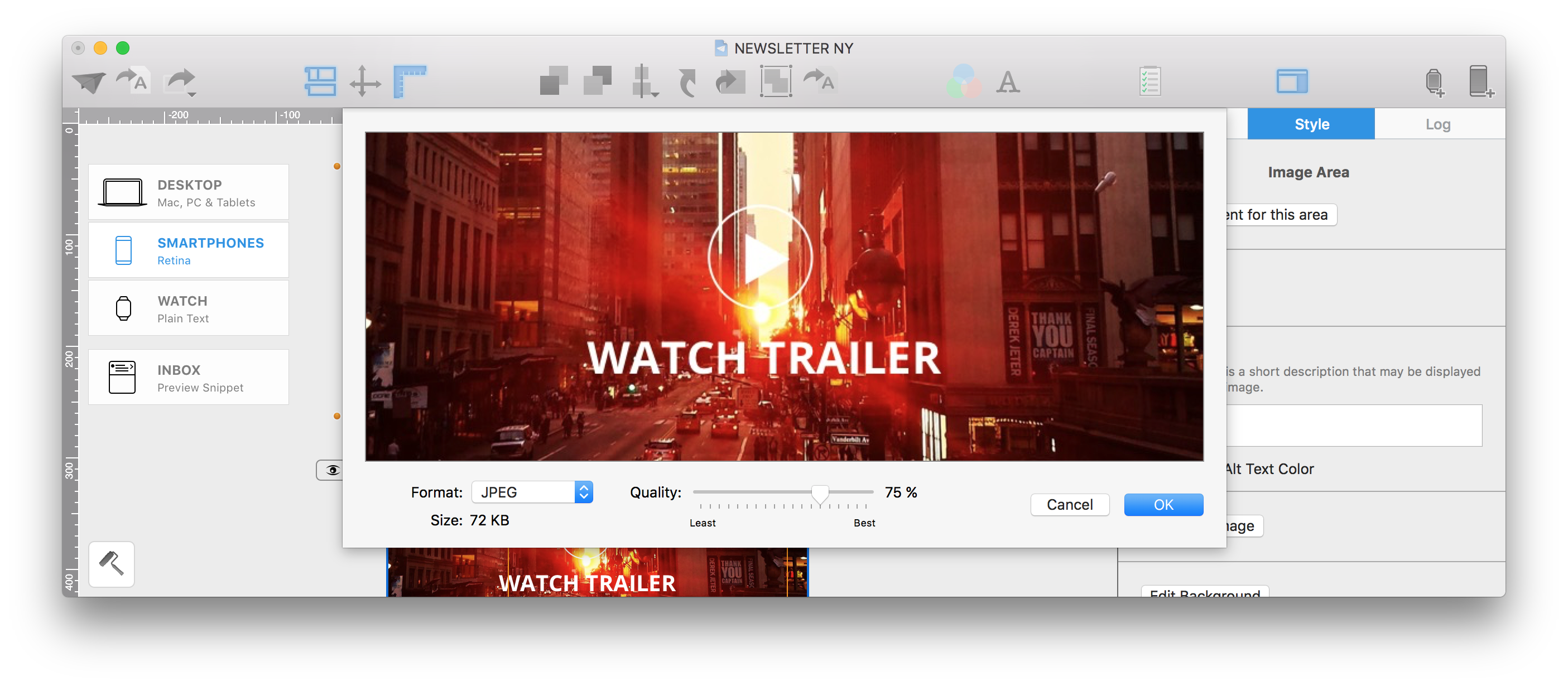
Using lots of high resolution pictures can cause the data volume of your newsletter to add up quickly. If you’d like to minimize the data for individual pictures, you can adjust the compression by going to Menu > Edit > Optimize Image. Switch the tab Format from automatic to JPEG. Then you can adjust the quality down to a value of 75%. Now you’ve definitely reduced the amount of data.
