Digital mailboxes are the catwalk for today’s email marketers. You only have a short time to make an impression for your Spring SALE or your up-coming event. It’s time to get your newsletters into shape! These 7 Mail Designer tips are sure to make your next campaign a hit!
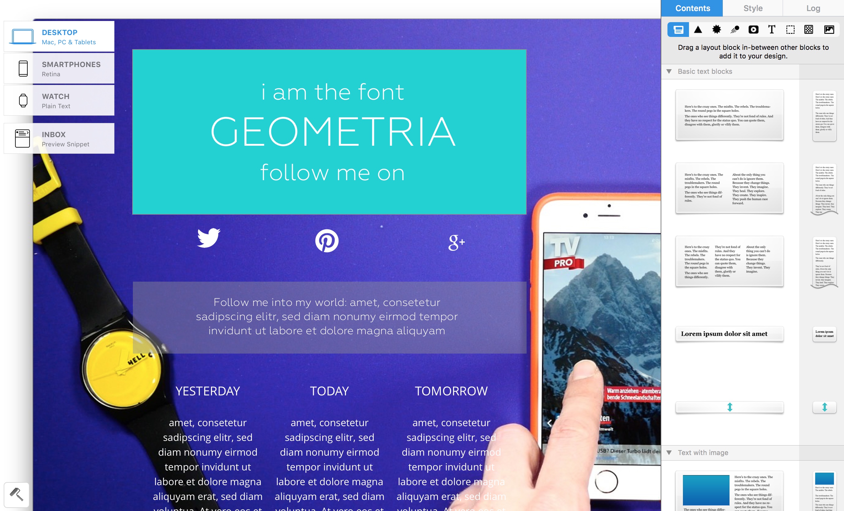
1. Word up – 3 new Design fonts you absolutely need
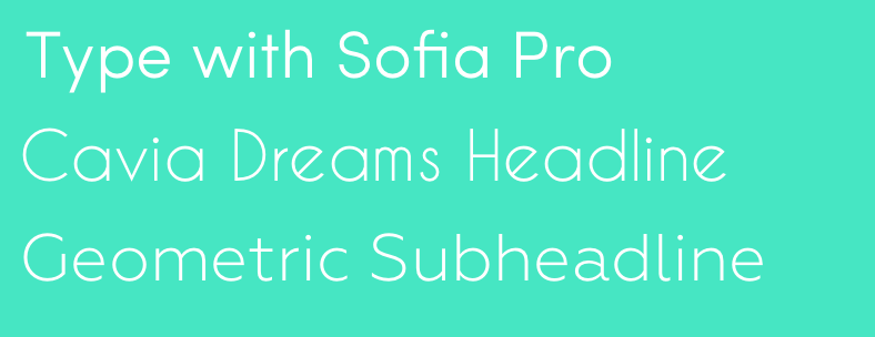
- Geometria
- Sofia Pro
- oder Cavia Dreams.
2. Call for Colors – become a master in color matching
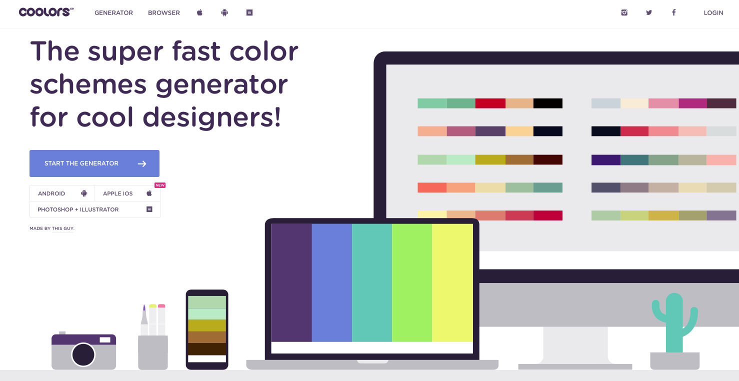
Which colors are hip and which fit together? Usually, you just need the right combination. If you’re looking for some good color schemes, check out the Web Color Generator coolors.co. Pull out some cool spring hues and match them with stylish Design colors. So much inspiration!
Do you prefer material Design colors? Then give www.materialui.co/colors a whirl.
3. Get the Look: How to create cool picture leads in minutes
Pictures and photographs build a relationship between newsletter and recipient. Dynamic content gives you a greater share in your campaign. Mail Designer gives you many possibilities for how you can put yourself directly into the scene.
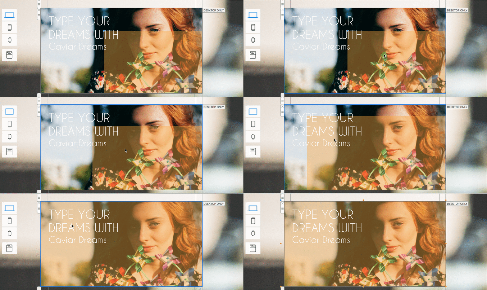
Drag your lead picture into an image area. To make it more attractive and easier to see a text, first choose a geometric shape to lay over the picture and adjust the color transparency to around 25%. Then you can integrate your text into the upper most area, making it more visible.
3. Shake your hips – How to create GIF animations in only seconds
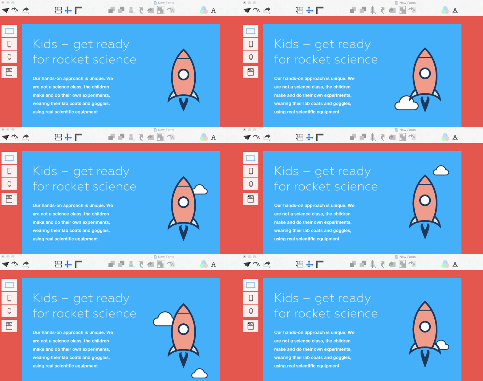
Make a great impression with some hot moves in a GIF animation. If you only need to capture a short bit for a tutorial, then give Record it a go. Just choose your screen section, record, and a GIF is automatically created. If you already have a video, then the quickest possibility is Drop to GIF. App: your video in - GIF comes out - it’s that easy!
5. Layout blocks and make up – This trick gives your newsletter more depth
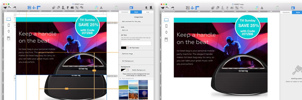
Bring more depth to your newsletters by connecting pictures from two image areas. With this trick you can create more elegant and interesting transitions. Just copy your chosen picture twice into two image areas arranged above one another.
Now you can move them around and adjust them just the way you want. One very effective way is to use a white background for the lower image area and a mood picture as a background for the upper image area - as seen in the example picture.
 6. How to create touchy call-to-actions buttons you have to push
Labeling
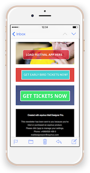
Instead of simply labeling with “Click here!”, it’s important to use active language to motivate your recipient by giving them clear instructions of why they are clicking. For example: Download the app for free
Shape
Clear, rectangular shapes with large font are the standards for most buttons. However, in some areas, a round Call-to-action button can look very elegant and be super click friendly. Give it a try for for videos, downloads, or sales!
Color
Not only the shape can affect the effectiveness of a of a button, but also the chosen colors. It’s best to test the colors for effectiveness depending on the your own brand or your specific purpose.
RED has an alarming impact and is energetically charged
BLUE conveys trust and security at first glance
YELLOW arouses interest and has a positive, sunny effect
GREEN stands for relaxation, sustainability, and growth
ORANGE s buoyant, motivating, and conveys motion
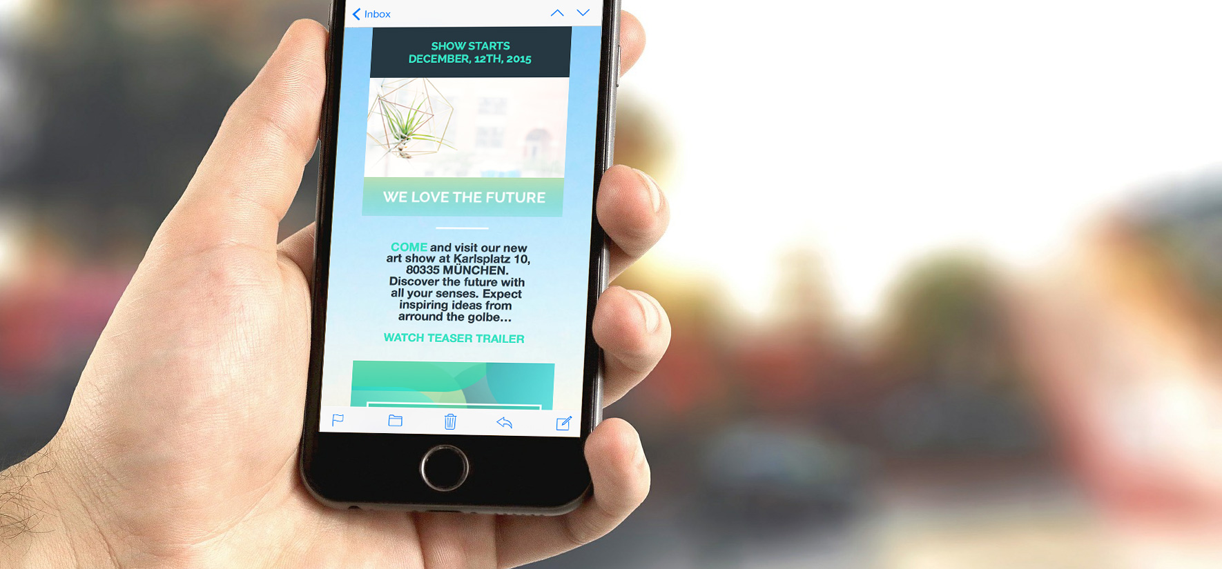
7. Why real text links are still in
Apple introduced 3D Touch along with the new iPhone 6s. If you build text links into your mobile newsletters, iPhone 6s users can catch a preview glimpse of your website with only a short touch. It’s possible to jump directly to map apps with a link or to automatically add dates into your calendar. In the Style Palette from Mail Designer Pro, you’ll find tools to help make your text links more interesting. Find out more about Peek and Pop Design this in this article.
