You can increase your sales potential with mobile-ready newsletters. Studies find that people look at their phones an average of 150 times per day. The online-ready target group of mobile users has risen drastically and almost half of all emails these days are opened on mobile devices. Would you believe, only 11% of todays newsletters have used responsive design techniques to optimize their layouts for mobile devices? Don't miss out on the incredible potential of mobile-ready marketing.
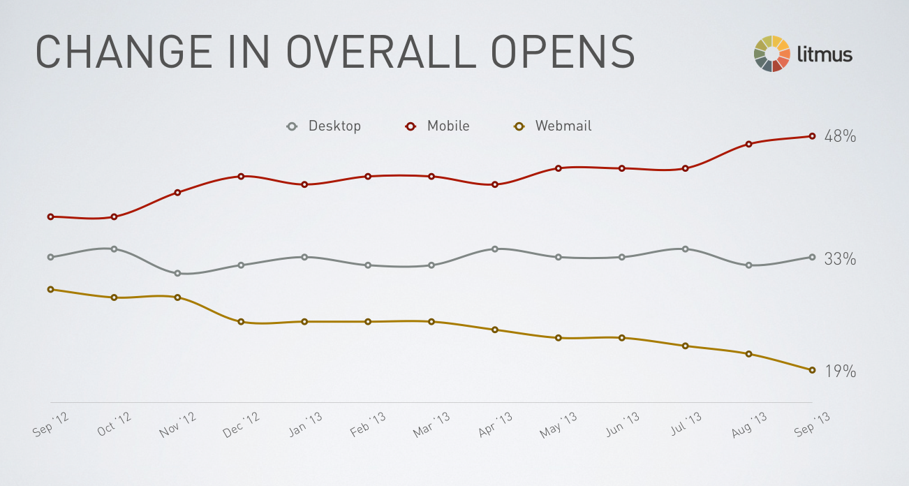
You can’t miss the the masses of people staring at their miniature displays while lounging in cafe’s, commuting on subways, and waiting in airports. It’s no wonder that the amount of emails read on mobile devices has increased as well. The email preview service, Litmus, recently published on its Litmus blog that 48% of all emails these days are opened on mobile devices.
It’s no surprise that marketing campaigns today need to be trimmed for pocket access, and now is the time for action as Black Friday, Cyber Monday, and the Christmas season roll in.
Cyber Mobile Day
The IBM Black Friday report made an impression with its 2012 report on how great the mobile potential really is. It claims that around 14.3% of all purchases are made online and that 24% of the shoppers visiting an online store, do so from a mobile device. 58,6% of all the mobile traffic was from smartphones.
High time to optimize Black Friday campaigns for smartphones
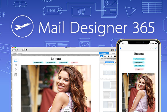
Zooming on a smartphone is so yesterday. Mail Designer Pro automatically creates a preview of the mobile version of your desktop newsletter. The so called, responsive engine, generates a flowing, reader-friendly layout. Remember!, 80% of people delete an email if it doesn’t look good on their mobile device.
Keep your mobile message to the point: The independent mobile layout blocks and variable mobile preview in Mail Designer Pro are powerful tools for creating quality content targeted for smartphones and tablets. To give your campaign that extra mobile kick, it’s prudent, within the first 1/3 of the mobile newsletter, to keep the texts and picture material short, so that the readers get the general essence quickly. You only have a few seconds to catch the attention of your mobile readers, and Statistics claim that only 3% of people will view the same email on more than one device.
Get your click: There are many discrepancies as to what makes a good call-to-action button. But one thing is clear, you shouldn't have to dislocate your finger to click. With the intuitive design tools in Mail Designer Pro, you can easily make your links, buy-buttons, and eye-catchers touch compatible.
Mail Designer Pro is available now for only €89.99 in the equinux online store. Download the demo now with numerous mobile-ready demo designs to test.