While huge screens are nothing new in the Android world, the iPhone 6 and 6 Plus are the first smartphones that will have mass consumer adoption and also have best-in-class support for responsive emails. So what does this mean for us email designers?
Pixels vs. Points
First, it's important to understand how the new screen's pixel dimensions affect your email layout:
The original iPhone had a 320px wide display. This gave you 320 'points' of screen space to work with. The iPhone 4 thru 5s all had 640 pixels wide retina displays. Apple used those extra pixels to increase the crispness of text on the display (i.e. "retina"), so the available width for your layout was still just 320 points.
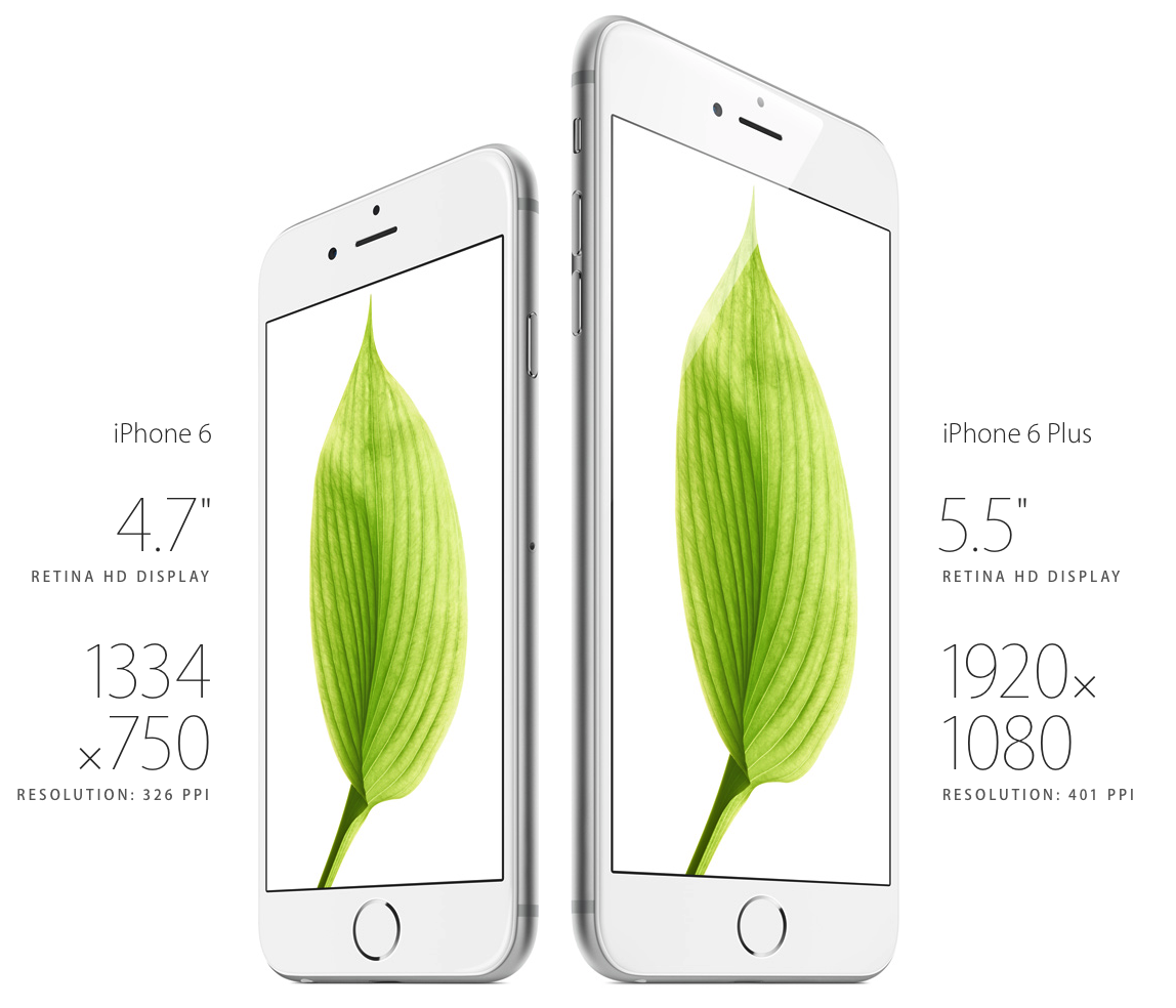
The new 'Retina HD' displays on the iPhone 6 and 6 Plus are the first iPhones to offer content more width on the display. The iPhone 6 is 750 pixels wide and the 6 Plus is 1080 pixels wide. This translates to 375 points on the iPhone 6 and 414 points on the the iPhone 6 Plus.
| Device mode | Original iPhone | iPhone 5 | iPhone 6 | iPhone 6 Plus |
|---|---|---|---|---|
| Portrait (pixels) | 320px | 640px | 750px | 1242px |
| Portrait (points) | 320pt | 320pt | 375pt | 414pt |
| Landscape (pixels) | 480px | 1136px | 750px | 2208px |
| Landscape (points) | 480pt | 540pt | 667pt | 440pt (effective) |
Until today, designing for 320 points has ensured that your mobile layouts will fit perfectly on all iPhones. With the new device sizes, you can start to optimize for the larger size!
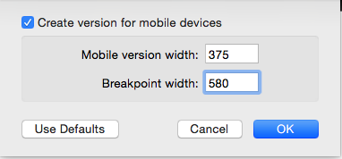
Choose a mobile width of 375 points in Mail Designer Pro and your entire message content will fit perfectly on the iPhone 6, be scaled up to fit the iPhone 6 Plus, and will also be displayed in its entirety on older iPhones, as they automatically scale down the message (to approx. 85% of the original size).
Mail Designer Pro makes this easy to do: just pull up the mobile options from the File menu and enter your new mobile layout width:
So why not go even larger and use the iPhone 6 Plus resolution? Well, if you choose 414 points as your default size, your message will shrink down to 75% of their original size on older iPhones, which will make fonts and buttons too small to read for many users.
What about landscape?
In landscape, you have two options on the new devices: either continue to display your new mobile variant (375 pixels wide), or switch to showing your full-sized desktop layout. However, despite being the bigger of the two, the iPhone 6 Plus uses its additional screen space to show the user a list of messages on the left hand side of the screen, so the actual space left for displaying your message will be just ~440 points.
It's counter-intuitive, but it means that the bigger of the two iPhones will actually have less space to show your email in the regular landscape layout. This means that your mobile layout is probably still the best choice for the iPhone 6 Plus in landscape mode. (Note: it's possible that you might be able to swipe away the list view, but it doesn't look as though that is the case at the moment) Update: The iPhone 6 Plus offers a 'zoom' button that will make the email fill the entire screen in landscape layout, however the default view is with the sidebar layout.
The regular iPhone 6 does not support the new landscape layout, so your email can take up the entire 667 points of the display – giving it more than enough room to show a desktop email layouts.
The bottom line
The new sweet spot for mobile-optimized portrait layouts is the iPhone 6 screen width with 375 points. Your designs will scale up to look great on the 6 Plus in portrait ands still scale down nicely to look great on older iPhones as well.
Set your mobile layout breakpoint to 500 points to show your desktop layout to iPhone 5 and iPhone 6 users in landscape, or to 580 points to only show iPhone 6 users a desktop layout on their new larger screens. And don't forget to check your mobile layout design on the iPhone 6 Plus as well.
P.S. Create iPhone 6 ready layouts today
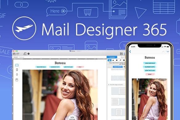
Mail Designer Pro offers you the flexibility you need to design for a range of mobile devices. Preview iPhone 6 and 6 Plus layouts today using custom device previews — we'll have more iPhone 6 and iOS 8 news for you in the near future.