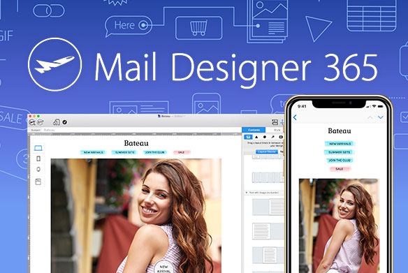
A few days ago we enhanced our productivity portfolio with Mail Designer Pro. You can create newsletters with responsive mail design without HTML programming.
Today every second email is opened on a mobile
Email communication still plays a very important role within the digital marketing mix of businesses. But the recipient's behavior has changed tremendously thanks to the smartphone boom: studies say from 42% to 50% of all emails are opened on a mobile device. Every second email is no longer read on the big screen of a desktop PC but on the small screen of a mobile.
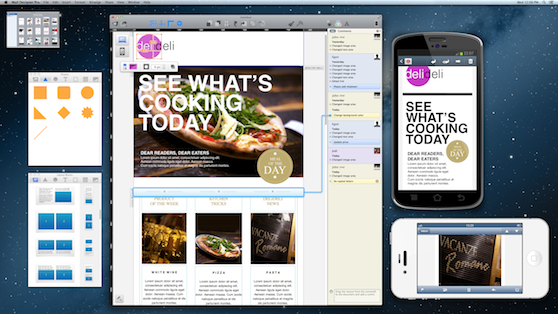
Mail Designer Pro automatically suggests a mobile variant of your newsletter
The paradigm of creating newsletters always starts with the desktop variant. If you want to have a mobile responsive mail, you have to program the HTML code manually which takes time and effort. Mail Designer Pro lowers the effort by suggesting a mobile variant right after you're done with your desktop newsletter. You can optimize your mail design comfortably by replacing existing items with mobile optimized items, by implementing mobile only items and by deleting items to shorten your newsletter.
Convince yourself
Mobile optimized newsletters are rewarded with higher click and conversion rates. Try Mail Designer Pro now for free.