Pastel vs. Sexy
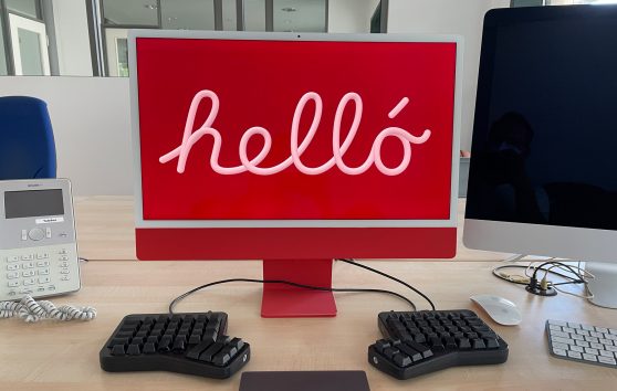
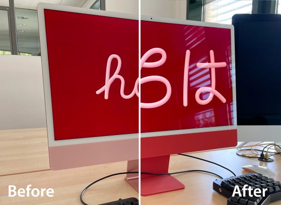
Our latest side project here at Zeitpunkt Haus in Munich has a very simple explanation: We don’t like the front of the new colourful iMacs. While the back looks stunning in either colour you choose, the front offers only a washed-out, pastel version of that. Or to be even more precise: Two variants. As one is glass (the chin) and the other is metal, even they do not go very well together.
To put it short: We skinned our iMacs’ front and base 😱
What is that sexy red on the back?
The first step was to find out the colour properties of that nice, strong, saturated back. That’s what we want to see on the front, too. We started with the red iMac.
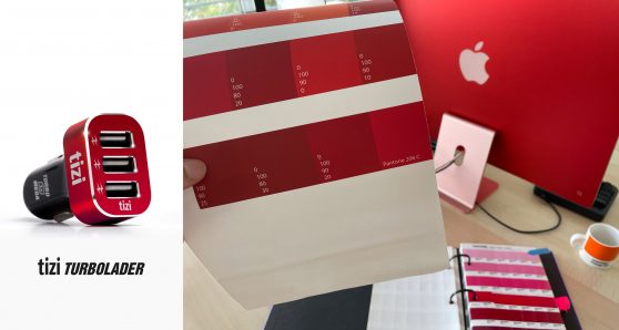
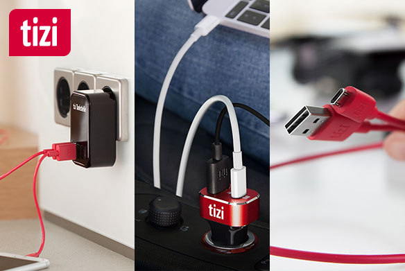
With the help of Pantone formula guides, it turned out that this red is very similar to the Monza red in our tizi line: That is Pantone 206, which is for instance the colour of the metal cooling head of the tizi Turbolader 3X MEGA in-car USB-charger. It just had to be a little bit darker.
Needless to say, you can hardly simulate an anodized aluminium colour with an inkjet printed paper, but still we wanted to get as close as possible - at least for the light circumstances in the office room where the red iMac found its place to live.
So, we printed a number of shades of that colour on the very same self-adhesive paper that we would later use to create the actual stickers and compared it to the sexy back-side of the iMac.
When we found out the actual CMYK values (0/100/90/20), we measured the iMac's chin and base and created the required forms in Illustrator. (Download the template).
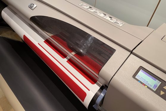
We printed the template on our HP 500 PS inkjet monster on self adhesive vinyl paper (HP Colorfast C6775A), cut it out as accurately as possible, and stuck it over the ugly pastel areas.
Et voilà: An all sexy-red iMac front and back!
