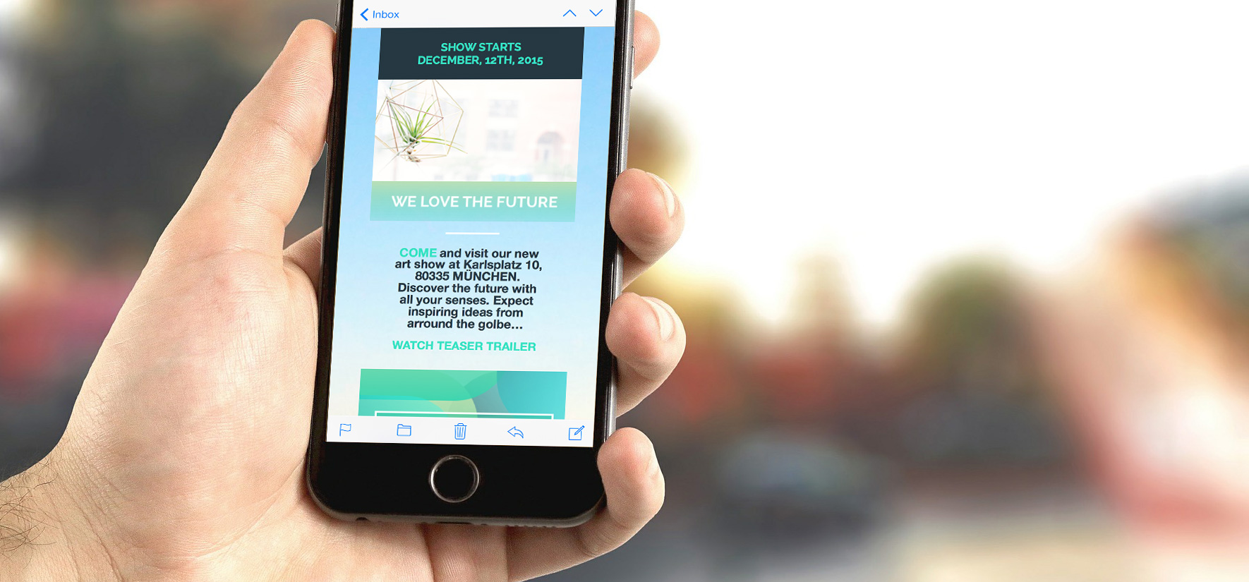
The mobile opening rate for emails has increased by 30% within the past 5 years. Far more than half of all newsletters are being read while on the go. It’s even more likely that your newsletter will first be previewed in quick scan mode on a mobile device than comfortably clicked and opened by the recipient from his/her personal Mac while sipping a peppermint tea.
For companies who rely on newsletters, this realistic scenario of recipients checking their emails on an iPhone can be compared to an action game where every newsletter has to battle to survive in the inbox. And as we know, in the end, only the strongest survive.
Mobile features, such as the new 3D Touch experience on the iPhone 6s, increasing resolutions, and expanding screen sizes, put an even greater importance on the details and content of your newsletters. With a short Peek and Pop, iPhone 6s users can quickly preview your Mails, without completely opening them. Yet another reason to be sure your newsletter Designs make a solid and convincing first impression.
The following Mail Designer Pro features and tips will help ensure that your newsletters are well received on the new iPhone 6s.
Boost the opening rate!
Your newsletter bouncer: Create better snippet texts for the iPhone 6s
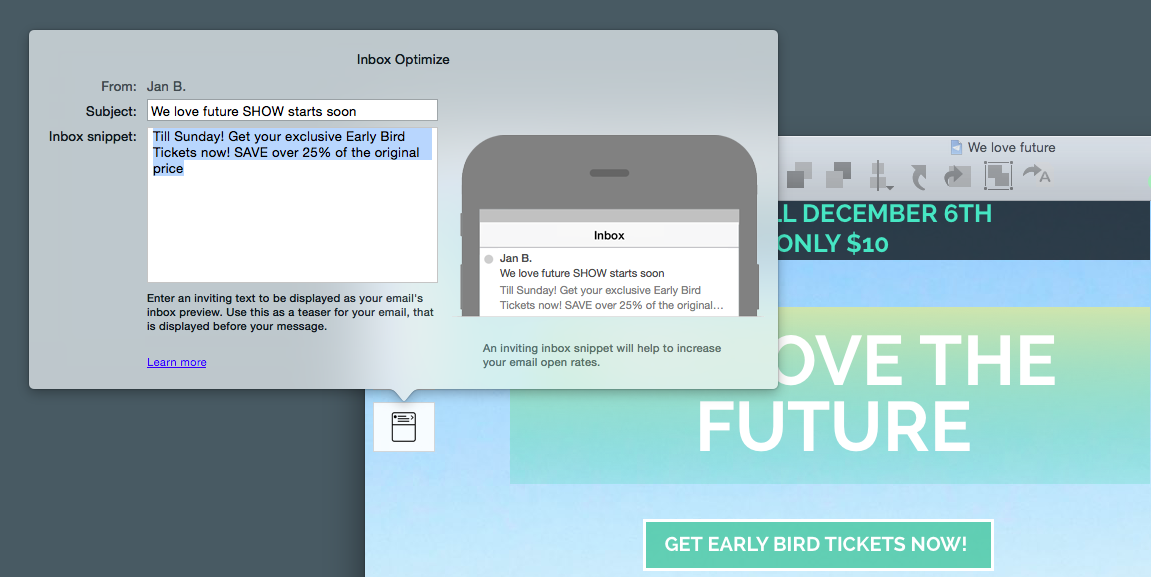
Like the subject line, the snippet texts are a deciding factor as to whether the recipients open your Mail or not. The iOS platform on the iPhone 6s allows for only 90 characters to create a catchy text. Here’s where micro-marketing definitely comes into play. It’s important to give the recipient enough content value that they feel the need to open your Mail.
The inbox optimizing tools in Mail Designer Pro help you create perfect, catchy lines, and with the simulator, you have a realistic, live preview of your subject line or snippet text making it easier to optimize.
Bear in mind…
- Keep the snippet text length between 40 and 50 characters
- Snippet lengths are platform dependent and vary between 40 and 140 characters.
- Your snippet text should support your subject line
- Your snippet text should also correspond to the content of the opened Mail and not simply be a repeat of your headline

Hit and run! Optimize iPhone 6s newsletters for on-the-go readers
K.I.S.S., Keep it short and simple. The mobile version of your newsletter is meant to be a taster, giving the reader an essence of what the desktop email is about. Remember, your newsletter will most likely be read while the recipient is at work, on the subway, or quickly browsing through emails while having breakfast. Even more of a reason why your newsletters need to make an immediate bang! All graphic elements you use should have the highest resolution possible for HD Retina optimized displays.
With Mail Designer Pro, you can create newsletters with Retina quality resolution, using the mobile layout and optimized mobile layout blocks. The new Artwork Collection offers catchy full surface lead pictures and more than 500 web fonts for captivating your recipients.
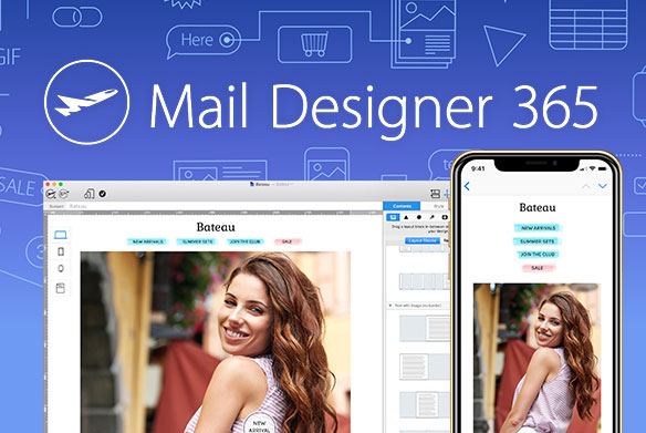
And another thing: Mail Designer Pro simulates 1:1 with an iPhone 6s preview, displaying how your newsletter will appear both in portrait and in landscape.
Keep in mind:
- Place large call-to-action buttons in the upper third of your newsletter (min. 15px)
- Leave white space between your CTA and your layout so that the reader doesn’t accidentally click elsewhere
- Only use high definition Retina graphics
- Check to make sure everything works smoothly in landscape mode
 Your shortcuts to success:
Adjust your newsletter Design for Peek and Pop
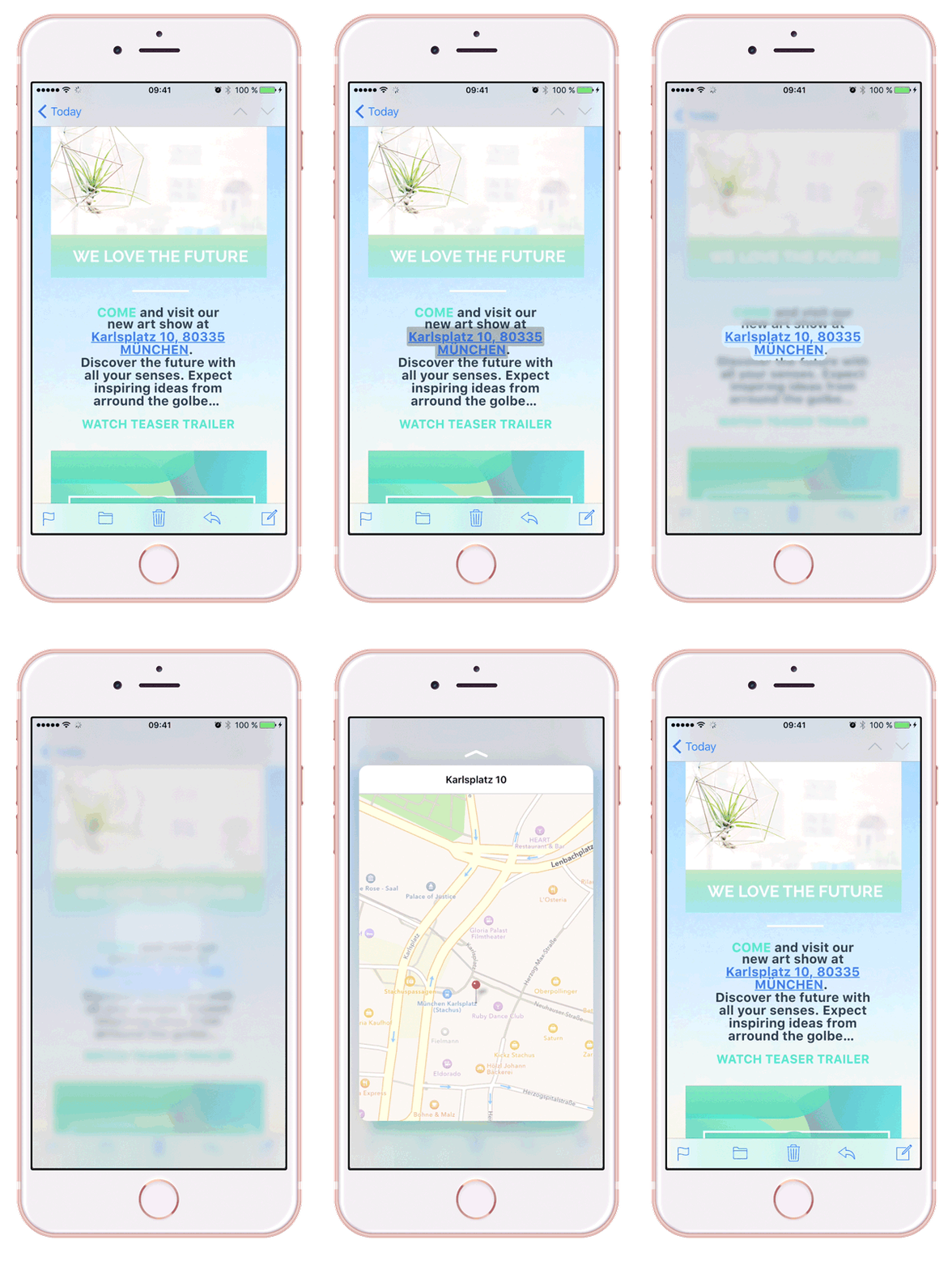
The iPhone 6 is ready for the newest touch features, offering Peek and Pop. With a longer push on any email in the inbox, the reader is now able to jump to a quick sneak-peek into the email. By pushing a little harder, the email is fully opened. The short preview now counts towards your newsletter opening rate. This new gesture offers a world of possibilities for your Mails, giving readers the possibility to quickly jump to addresses, maps, and landing pages through text links.
You can format your links in Mail Designer Pro by choosing appropriate colors and sizes to fit the style of your newsletter. This makes your links stand out from the conventional blue, underlined links.
If you’re going to incorporate Peek and Pop features, be aware:
- Linked graphics and pictures will not work.
- Instead, you’ll need to integrate simple text links into your newsletter Design
- To link your addresses (for example: a cool store link or company address) with a map, it’s best to separate them with a comma in one line (for example: Street name, city, zip code)
- There is also a direct link for dates and times. Via Peek and Pop, the readers can automatically add an event to Calendar. For example, the expiration date of a coupon: “Use by tomorrow, 3:00pm 12/12/2015”.
- Lead readers to landing pages and sales pages from your newsletters
- Test all of your desired effects with a test Mail from Mail Designer and an iPhone 6s
