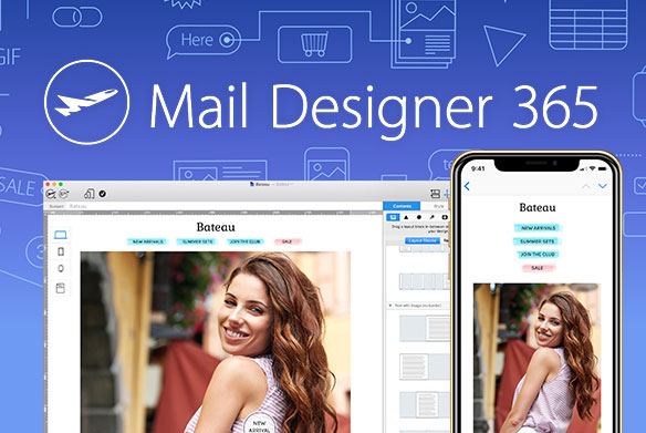
 A new year is a new chance to introduce new ideas and workflows to up-coming projects. The following 5 Mail Designer tips are your kickstart helping your newsletter styles perform optimally in every mailbox.
Tip #1: Make 2015 smarter and crisper
Meanwhile, there are more than 1 billion smartphones in use worldwide and the new larger phablet displays are becoming more popular. This means that people are increasingly utilizing their smartphones to complete desktop tasks.
Without a user-friendly design, newsletters fail to reach an important target group, since more than half of all users access their email with their smartphones.
With the help of Mail Designer Pro 2, your desktop design can easily be optimized for the newest flagship phone generation such as; iPhone 6 Plus or the Nexus 6. What’s really important is that all graphics remain crisp and in high definition for both desktop and mobile varieties.
Tip #2: Attract attention with full screen backgrounds
Have some great pictures? Why not use one as a full screen background for your next newsletter campaign? Just paste your picture into the background of your Mail Designer project and delete the background of the text blocks. This style of newsletter is particularly inspirational and acts as a real inbox eye-catcher for every promotions, specials, or event announcements.
 Full screen backgrounds are catchy
Tip #3: Keep it moving - Animate your recipients
GIF animations have had a real come-back in the social media world. Why not include these into your newsletters, creating a fun, lively header to surprise and delight the readers?
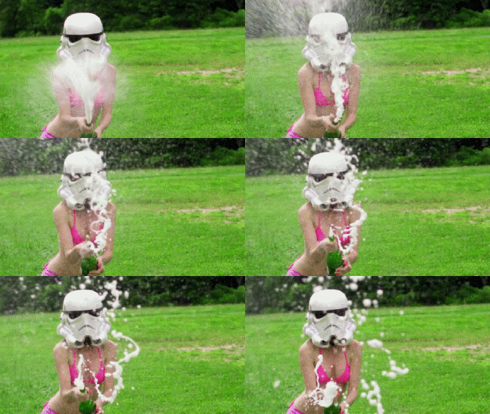 With tools such as the Image GIF Generator, you can create little GIF sequences from your YouTube videos or upload individual pictures and create your own GIF animations. When using this format, you only have 256 colors and a strong compression, which is fine for a cute little animation, but does not offer a higher quality picture. If you need a higher quality animation, use a simple animation, such as those found in the Mail Designer animation palette. You can also embed a YouTube or Vimeo video into your newsletter.
Tip #4: Show your style with cool fonts
Stand out from the crowd by using cool fonts for your newsletter headlines. With more than 500 web fonts (Mail Designer Pro 2 only) to choose from, the doors are open to a world of typographic highlights. If you’re having trouble deciding, search for tipps from design geeks/bloggers such as Katelyn Brooke who have mostly postings of web fonts which are always a hit.

Tip #5: Homemade flat-style
Keep it simple, flat, and transparent: pretentious 3D effects have been out of style for a long time. With the Shape Tool, you can easily design and create your own call-to-action buttons and overlays with a hip but flat design.
Colors: For some cool ideas and codes for flat color design, check out flatuicolors.com.
Shapes: The Shape Tool has what you need for any shape design
Fonts: For labeling, it’s best to use a classic design such as: Helvetica (bold) to name your buttons
Transparency: The opacity of your objects can be edited below in the Color Palette where you can produce transparent overlays.
