We all know that mobile email reading habits are on the rise, but surprisingly few emails have mobile-optimized layouts.
We did some research and started collecting email newsletter samples from all over the web. We focused on newsletters from major brands and well-known companies with large marketing budgets.
Out of 10087 emails we collected in June 2013, only 11,84% used responsive design techniques to optimize their layouts for mobile devices.
Why do we need responsive layouts?
Most mobile email apps start off by displaying an email at full width. So if your email design is 800 pixels wide, it will shrink down and display like this on an iPhone:
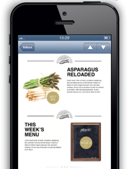
At that size, users will have to zoom in to be able to read your message, so your pitch or headline can’t be read unless the user decides your message is worth checking out more closely.
Mobile design is not narrow design
Some designers compensate for this issue by simply making their designs narrower. However this tends to make the layout look terrible in desktop email apps. An email that is 320 pixel wide will look awkward or broken on desktop computers.
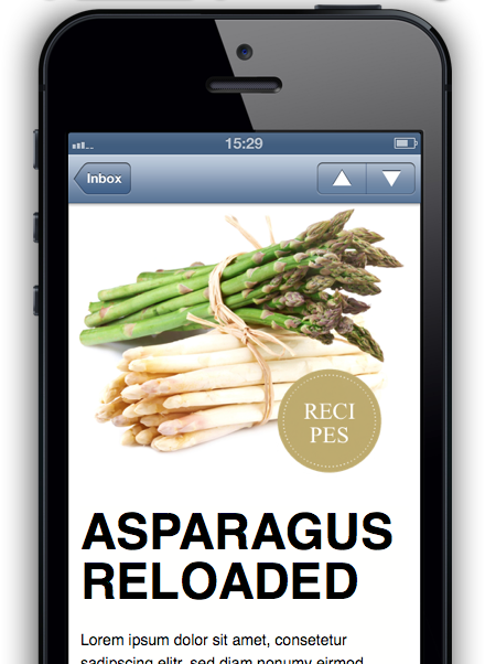
Instead, designer's should create a design for desktop users that takes advantage of today’s modern widescreen displays, and use responsive techniques to allow that same design to re-flow into a mobile-optimized layout. All layout blocks in Mail Designer Pro will automatically adjust to the device your mail is opened in – so a picture set next to text will automatically displayed with the image underneath the text on mobile devices, making the text appear larger and easier to read.
Adapt for mobile
Parts your design may need to look different in your mobile layout: add mobile-only content, or remove the sections of your message that aren’t suitable for mobile devices.
Often you’ll also want to choose different images, or zoom in on the most important section of your image for mobile users – simple with the right tools.
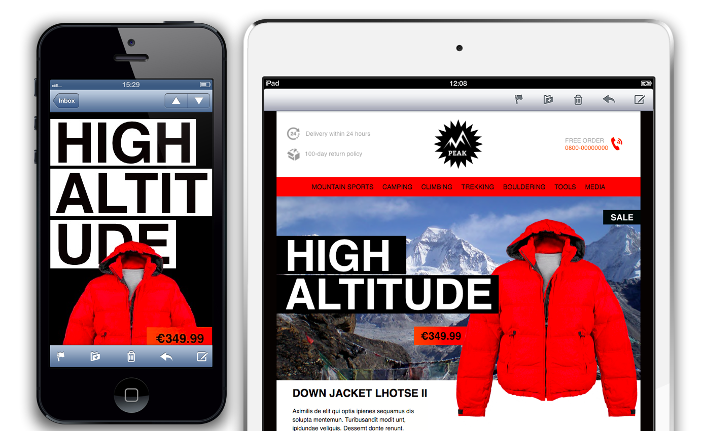
(shown here: two Mail Designer Pro mobile previews)
Wrap up
So that’s a first look at mobile email layouts. Studies have shown that mails read on mobile devices have higher conversion rates, but you can only tap into that potential if your message is mobile-optimized.