A good call-to-action link the most important part of any newsletter. Once you've convinced readers they should click your link, the design, position and destination of your link need to be optimized to offer a good experience to your reader and help them reach your destination.
Here are a few essential tips to make sure your links are ready to go:
1. Build up to it
It's tempting to put your primary call-to-action link right at the top of your newsletter. While it's never a bad idea to also link your header image to your target destination, you can't expect readers to visit your call-to-action link without prior information and convincing arguments.
Make your case in the upper part of your email and use clear, concise text to let your reader know why they absolutely should click your CTA.
2. Size Matters
Your newsletter should make use of attractive photos and eye-catching images to draw in your readers. But make sure your call-to-action doesn't get lost in the mix: Make your call-to-action nice and large and leave some space between it and other visual elements in your design.
This example uses bright colors and lots of white space around the element to make it stand out and really obvious:
![]()
This is especially important in your mobile device layout: make sure your link is easily tappable and impossible to miss.
3. Mobile-friendly
Over 53% of emails are opened on mobile devices – so of course your design should be mobile-responsive.
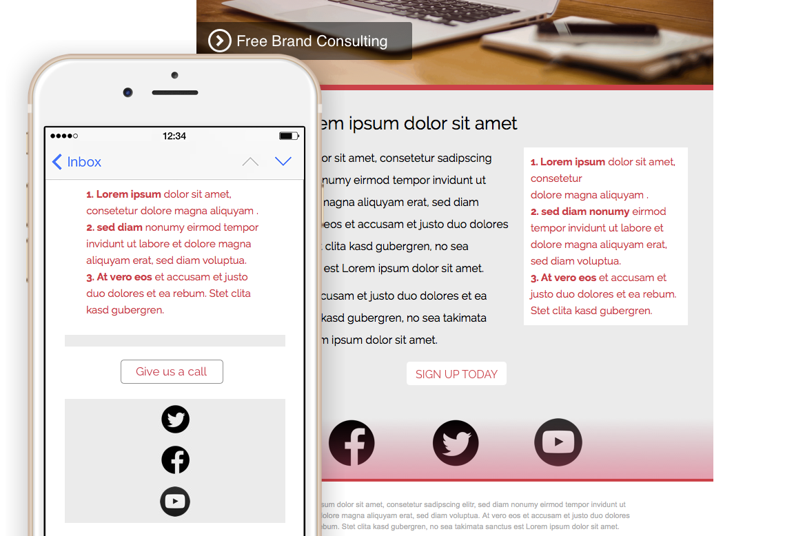
But don't forget about the places you're linking to: with Mail Designer Pro, you can create separate call-to-action links for desktop and mobile devices, allowing you to choose a optimized target for each.
For example, if you're trying to generate leads, you could send your desktop readers to a sign-up form and add a phone link for mobile users:

Or you could link to a different page or even jump into a specific app using custom URL schemes in Mail Designer Pro. At equinux we use this feature all the time to link directly to our apps on the App Store on mobile devices and to a product information page on desktops.
4. Don't screw up
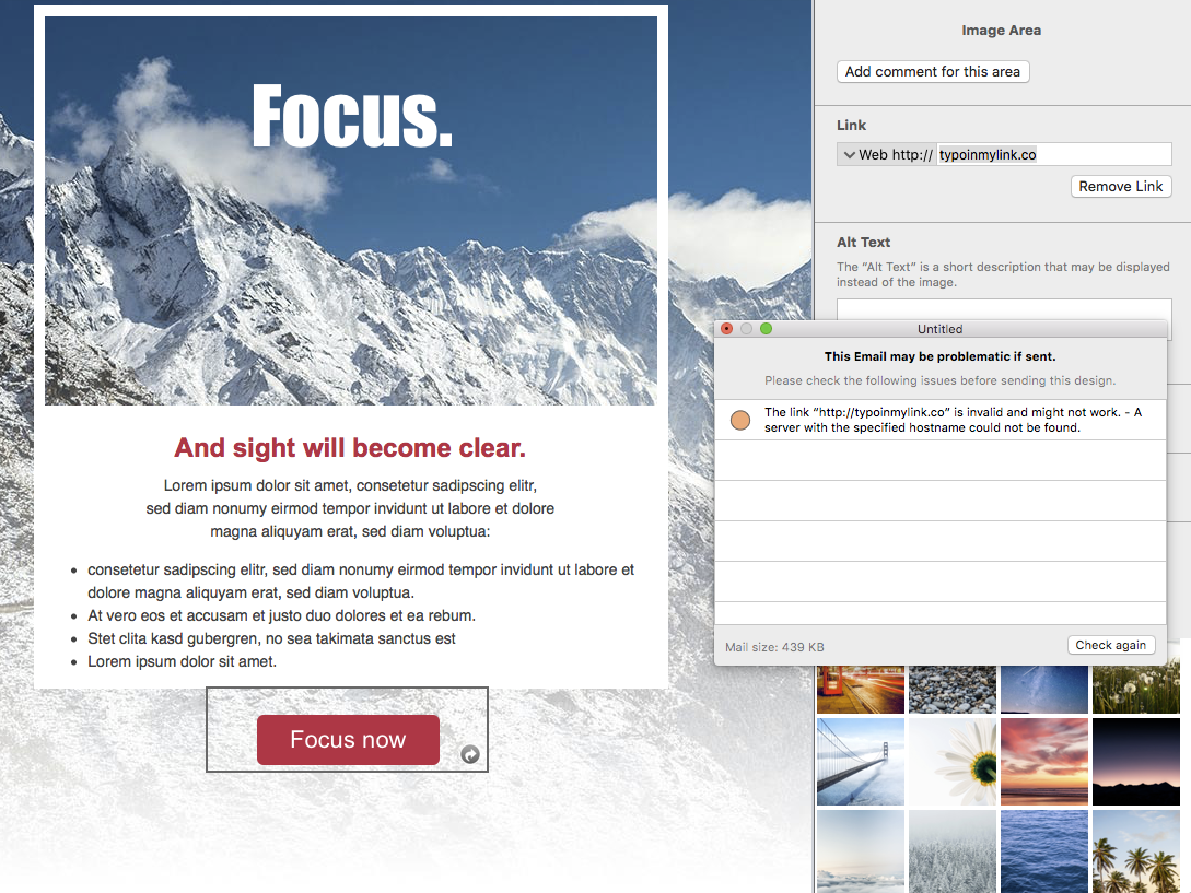
There's nothing worse than sending out an email and then realizing a link is broken. Be sure to check all your links before hitting send – or just use the preflight feature in Mail Designer Pro, which automatically checks that all your links work).

5. One message
You've probably got a few things to tell your readers. But when it comes to your call-to-action, it's best to stick to just one per email.Offering multiple main call-to-action links increases the cognitive load on your readers and they'll often choose to click nothing at all, instead of making a choice.
Pick your most important goal and focus on that.
For more tips, be sure to sign-up for our newsletter. And don't forget to check out Mail Designer Pro – the easiest way to create mobile-responsive email newsletter with a fantastic CTA 🙂